Cadence newsletter
A light-first creator-newsletter landing in the bento-grid style: warm cream tiles on a near-black ink field with 2px gridlines, bold Montserrat display type, and six pastel gradient accents. Ships with a hero + email capture, a sample-issue grid, social proof, a benefits checklist, an author block, a dark subscribe CTA, plus a rich editorial article page (drop cap, gradient pull-quotes, full-bleed and 2-up images), a thank-you page, legal pages, and a 404. Built for writers, makers, and indie newsletters.
by Mythos·0 remixes
Key Highlights
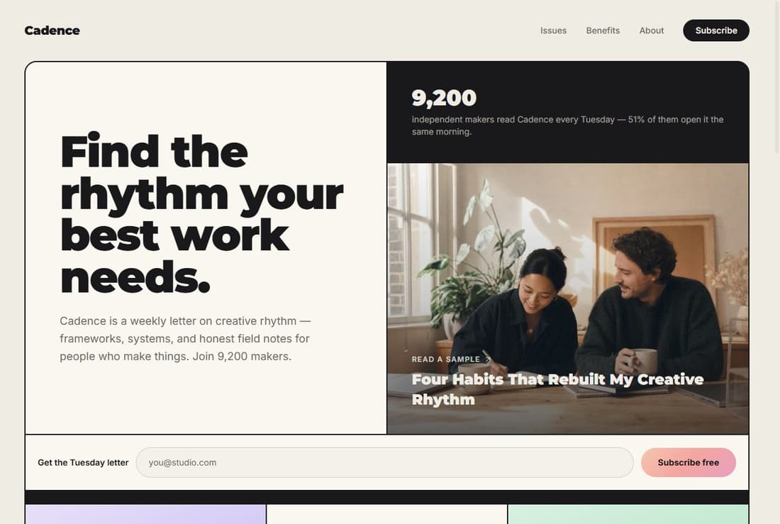
Bento-grid landing
Cream tiles sit on a near-black ink field so the 2px gaps read as drawn gridlines.
Ready-to-wire email capture
Regex plus required type=email validation, simulated submit that routes to a thank-you page.
Six pastel gradient accents
Coral, lilac, mint, peach, sky, and holo gradients defined once as Tailwind utilities.
Rich editorial article page
Drop cap, gradient pull-quotes, full-bleed images, and 2-up image pairs in one post layout.
Responsive and accessible
Mobile-first grid, focus-visible rings throughout, and reduced-motion-aware entrances.
Features & Capabilities
Production-ready features built into the scaffold from day one.
About this template
Cadence newsletter is a light-first landing page for creators, writers, and indie newsletters. It opens with a bento grid: warm cream tiles laid on a near-black ink field, where the thin 2px gaps between tiles read as drawn gridlines. A hero headline, a reader-count stat, a sample-issue photo, a benefits checklist, social proof, an author block, and a dark subscribe call-to-action stack down the page, and every email field routes to a clean thank-you confirmation.
The craft is in the details you can see in the code. The palette is a cream paper background, a near-black ink for headlines and dark sections, and a coral accent for focus rings and links, lifted by six pastel gradients — coral, lilac, mint, peach, sky, and a multi-stop holographic blend — each defined once as a Tailwind utility. Type pairs bold Montserrat display headlines with Inter body text. Entrance animations slide gently upward while keeping opacity at full, so content is never hidden from crawlers or deep-links, and they stand down entirely when a visitor prefers reduced motion.
Who it's for
- Independent newsletter writers building a subscriber landing page
- Makers and creators promoting a weekly letter or digest
- Solo creative coaches and educators with an audience to grow
- Writers who want a magazine-style article page to show a sample issue
- Anyone who wants a warm, editorial alternative to a plain signup form
What's included
- A landing page built as a bento grid of tiles on an ink field
- A hero section with the page headline, a credibility stat, and inline email capture
- A sample-issue grid of three teaser cards, two on pastel gradients
- A social-proof band with a reader quote and a link to the full sample issue
- A benefits checklist with six gradient-badged rows
- An author block with portrait, bio, and shared social links
- A dark subscribe call-to-action section over a gradient wash
- A footer with brand line, social links, and privacy/terms links
- A full editorial article page with a drop cap, gradient pull-quotes, full-bleed figures, and 2-up image pairs, plus a share bar
- A thank-you confirmation page the form routes to after a valid submit
- Privacy and terms pages sharing one numbered-section layout
- A branded 404 not-found page
The email capture is validated and ready to wire: it checks the address with a regex and the browser's required email field, shows a submitting state, then routes to the thank-you page. The submission is simulated client-side — there is no backend, database, or stored data — so you connect your own email provider when you're ready.
Best use cases
Launch a creator newsletter
Use the hero, benefits, and dark subscribe sections as a focused signup page for a weekly letter. The two email forms share one component, so a single edit updates the whole capture flow.
Show a real sample issue
The editorial article page lets a visitor read a full issue before subscribing, with a drop cap, pull-quotes, and full-bleed imagery that make the writing feel like a finished publication rather than a preview.
Build trust before the ask
The social-proof band, reader-count stat, author block, and plain-language privacy and terms pages give a new subscriber every reason to commit, all in the same warm, consistent design system.
Make it yours
1. Remix the template
Start from this template on mythos.new to fork it into your own private project. You get the full bento-grid landing, the article page, and all the supporting pages as your own editable copy.
2. Customize your brand
Edit copy, palette, type, and images right in the in-browser IDE, or just describe the changes in chat. Swap the brand name, rewrite the hero and benefits, replace the sample issue with your own writing, and recolor the gradient accents to match your voice.
3. Publish
When it looks right, publish straight to a <name>.r21.dev subdomain. Your newsletter landing goes live with one click, and you can keep iterating and re-publishing anytime.
Related Templates